Monday, 18 October 2010

Wednesday, 13 October 2010

Locations


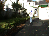
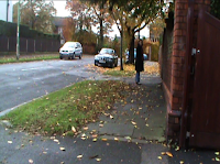
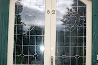
These pictures are all my house. The first one is the first set of stairs, which I am going to use for the Point of View shot of him going to look for the girl. The second is the stairs from the side which is for the Pan of him going past them. Pictures 3, 4 and 5 are the front door which will be used for the match on action shot of him going into the house. The last two pictures are the House and the garage the house is a point of view shot as they walks into the garden and the garage is a Long shot as they walk past it to perform in the garden.

Tuesday, 5 October 2010

Genre research

Pop music is a term that originally derives from an abbreviation of popular music and is usually understood as commercially recorded music aimed at the youth audience. It is associated with rock and roll and later rock. Other genres that have influenced pop are R&B, Jazz, Folk, Dance and classical music. It was culturally introduced into the UK and USA in the 1950's. Some of the instruments sterotypically associated with pop are Electric guitar, Bass guitar, Drums, Keyboard, Acoustic guitar and the Piano.


Characteristics

  • An aim to appeal to a general audience rather than to a particular group of people.
  • An emphasis on production, recording and technology rather than live performance.
  • A tendency to reflect any already existing trends instead of creating new trends or developing them.
  • Modern pop songs also in their lyrics focus on themes of love and romance as these are simple themes. However there are many examples were this isn't the case.

Friday, 1 October 2010

Tuesday, 28 September 2010

Monday, 20 September 2010

Smash Mouth- I'm a believer

I thought love was only true in fairytales (0:05-0:10)
Meant for someone else but not for me (0:11-0:14)
Love was out to get me,that's the way it seemed (0:17-0:21)
Dissappointment haunted all my dreams (0:21-0:26)

Then I saw her face (0:27-0:28)
Now I'm a believer. (0:30-0:32)
Not a trace (0:34-0:35)
Of doubt in my mind. (0:36-0:38)
I'm in love (0:40)
(ooooooaaaahhh)
I'm a believer, I couldn't leave her if I tried (0:42-0:46)

I thought love was more or less a given thing (0:49-0:53)
The more I gave the less I got, Oh Yeah (0:54-0:58)
What's the use of trying (1:01-1:02)
All you get is pain (1:04-1:05)
When I wanted sunshine I got rain (1:06-1:10)

Then I saw her face, (1:11-1:13)
Now i'm a believer. (1:14-1:16)
Not a trace (1:17-1:18)
Of doubt in my mind. (1:19-1:22)
I'm in love (1:23)
(ooooooaaaaahhhh)
I'm a believer, I couldn't leave her if I tried (1:26-1:30)

What's the use in trying (1:45-1:46)
All you get is pain (1:48)
When I wanted Sunshine I got rain! (1:50-1:54)

Then I saw her face (1:55-1:56)
Now I'm a believer! (1:58-1:59)
Not a trace (2:01-2:02)
Of doubt in my mind (2:04-2:05)
I'm in love (2:07-2:08)
(ooooooaaaahhh)
I'm a believer, I couldn't leave her if I tried (2:10-2:14)

Then I saw her face, (2:18-2:20)
Now I'm a believer. (2:21-2:23)
Not a trace (2:24-2:26)
Of doubt in my mind. (2:27-2:28)
I'm a believer, yeah yeah yeah yeah yeahhaah.... (2:30-2:34)

Im a Believer(2x) (2:26-2:46)

Thursday, 16 September 2010

Questionnaire


1. Do you listen to Garage/Pop music?

Yes 13 people No 7 people


2. What would you expect to see in a Garage/Pop music video?

bright colours up to date clothes

3. Do you watch music videos?

Yes 20


4. Do you like the lyrics to match the music video or not and why?


Yes 10 no 10

5. Which genre music do you prefer?


rock 5

pop 5

r and b 5

hip hop 5

initial ideas

  • Rock /Pop
  • Romance
  • Performance
  • Storytelling
  • Casual clothes
  • Sunglasses
  • Streets
  • Cafe/Restaurant
  • Love interest
  • Drums
  • Bass
  • Lead singer

Thursday, 9 September 2010

Audience Profile

The audience for pop music tends to wear casual clothes and listens to their ipod alot. They also tend to be between 10- 25 years old. They might also wear expensive clothes and shoes ( leather jacket and vans shoes). Most the people who i know that listen to pop are female.


Video shot count

143 shots in total. Several of these shots where meat shots this is because it is typical of music videos.

Wednesday, 8 September 2010

Magazine Advert Analysis


Most adverts have a picture of the cover or back of the album and also say IN STORES NOW or IN STORES SOON somewhere in the advert. They have a website that you can get more information from. They always have the name of the band on. Generally the picture is either of the band or it somehow represents the band. they also tend to use bold colours so that you can see it clearly from a distance and therefore you would be more likely to be able to see it instead of having to spend hours looking for it.


  • The image used of a zeppelin represents the name of the band (led zeppelin). This is used so that you can recognise that led zeppelin is the band if you cant see the band name. They put the picture in the middle so that it is clear to see if you are looking at it from a distance (in a shop). They also use a black background with a colourful picture for this purpose.
  • The text used for the name of the album is the same as the text used for the name of the band. This is because it is the style you associate the band with. the colour matches the colour of the picture so that it can stand out from the background.
  • This advert suggest that the music should be perhaps aimed at rock lovers because even if you didn't know who the band was the advert is dark and mysterious.


Monday, 5 July 2010

9 frame analysis

Friday, 2 July 2010

lip sync task


To do this task we used final cut. To start with we had to choose a song to lip sync to, we chose ke$ha's Tik Tok.

Tuesday, 22 June 2010

green screen tutorial

For this we used final cut.

The top image is how we deleted the green we took a sample of the shade of green , then moved the top colour bar along, we then used the sat and luna bars to change the colour of the new background. this can be found under effects- key then chroma keyer.

Monday, 21 June 2010

katy perry album covers

    Katy Perry- One of the Boys                                                                                                           

kanye west album covers


Album covers

This is the front cover of the All American Rejects album Gives You Hell. The A and the R with the lightening bolts help to represent the rock genre and is typical of the band. It could also help to represent the stereotype of what people picture when hell is mentioned. This goes with the name of the album and one of their songs " Gives you Hell". However this can also go against the song as the song is about a jealous ex boyfriend telling his ex that when he sees her he hopes she will be scared.

The font for "All American Rejects" is the same font that is used for the band name on each album and also for the covers of their singles, it looks like graffiti. This then means that when you see that font from a distance it helps you to tell that it is one of their albums. Where it says "Gives You Hell"the white goes slightly over the letters in a way that resembles fog. The font for it is also block writing which matches the font used for the A and R symbol, this all takes up the bottom half of the cover.

The band is sat on what looks a stage with crates behind them. They look very relaxed and are looking down as if you are a member of an audience they have just performed for, they are all also looking in the same direction as if they are all looking at the same person.


Monday, 14 June 2010

music video analysis


This is another music video by the same band 

Tuesday, 25 May 2010

my green warhol


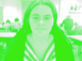
Creating this warhol is very simple. First of all take an image of yourself and put it into Photoshop. go to image>mode>grayscale. Then select the layer adjustment tool. Then go to brightness/contrast and change brightness to 25 and contrast to 55. Next go to image>mode>rgb, create a duplicate image and blur the image to 3 or 4. Next still on the duplicte layer change the lighting to soft light. Create a new layer on top of the duplicate layer and fill with any solid colour. Then select the colour layer and select lighten.

Thursday, 20 May 2010

my warhol


I started off by finding a picture of me and putting it in Photoshop. I then deleted the original background and added in a solid colour. You then have to blur the image. To do this go to filter>blur>smart blur. I suggest you set the radius to about 40 and set the threshold to around 15. then click okay. If you are happy with how blurry it is then delete the back up layer. Then create a duplicate layer of the blurred photo. click on the blurred photo layer, go to filter>artistic>cutout. It is best to set the level at about 3, I then set the edge simplicity to 1 but you could set it to 2 but no higher. Then set the fidelity to 1. If you wish to chance the contrast then go to image>adjustments>brightness contrast. Click on use legacy at the lower right of the box. To burn and dodge use the burn tool in the toolbar to add darkness to any shadows. Use the dodge tool to add any highlights.

my opie


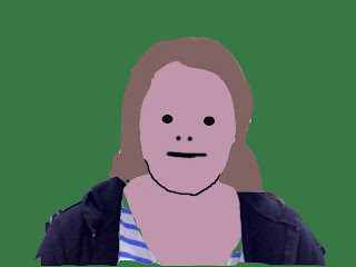
To create an Opie follow these steps:
  1. Start my making a new image. File>New
  2. Open your source image. Select the part of the photo you want using the marquee selection tool. Edit > Copy. Click on your empty picture you just made. Edit > Paste
  3. You will probably now need to resize the photo in your picture.

  4. Create a new layer and call it 'Hair'. Layer > New > Layer. Name the layer hair in the pop up window.

  5. Use the lasso tool to trace around your hair.

  6. Now use the colour palette to select a suitable colour for you hair. Then using the Paint Bucket Tool fill your hair.

  7. Make a new layer called Face and use the Lasso tool to draw around your face. You do not have to be accurate on parts of your face covered my hair. But take your time to trace your chin accurately. Then fill in your face with a suitable colour.

  8. Now make a new layer called 'features'. Using the pencil tool set to a large size click on 2 eyes. Make the pencil the right size for the eyes by moving the Master Diameter slider up and down. Remember to put the white dot in.

  9. Stay on the 'features' layer. Use the lasso tool to trace one eyebrow. Hold down the Shift Key and trace the other eyebrow. Smooth your selection. Fill the black with the Paint Bucket Tool.

  10. Use the paint or pencil tool to add your nostrils and mouth. Or you can use the lasso tool to draw trace your nostrils and your mouth. Fill in these selections.
  11. Now add your neck and ears. Make new layers, one for your ears and one for your neck. Use the lasso tool to trace them, then fill them. You can also add a stroke for them. I have also drawn some black lines on the ears using the pencil tool.

  12. Your clothes are made in the same way.
  13. Finally make one last layer. Move it to the back in the layer order window and fill it a colour.
REMEMBER: To save your work regularly as a JPG.